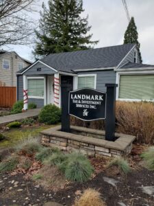
A business sign may look great when you are standing directly in front of it, but that does not necessarily mean it will work from the road. Drivers and pedestrians often have only a few seconds to notice a sign, read it, and understand what it is trying to communicate.
Whether you are designing a storefront sign, roadside sign, custom banner, or other large-format graphic, readability from a distance should be one of the biggest considerations.
Keep the Message Simple
One of the easiest ways to make a sign difficult to read is to put too much information on it. A business name, list of services, phone number, website, slogan, and several other details may all seem important, but trying to include everything can make the most important information harder to notice.
Think about what someone actually needs to know in the few seconds they have to look at your sign. In many cases, a clear business name and a short description of what you do will communicate more effectively than a long list of information.
Choose Fonts That Are Easy to Read
Decorative or highly stylized fonts may look interesting up close, but they can become difficult to decipher at a distance. Simple, clear lettering is generally easier for someone to recognize quickly.
Letter size matters too. Text that looks large while you are working on a design on a computer screen can appear surprisingly small once the sign is installed on a building or viewed from across a parking lot.
The farther away your audience will be, the larger and simpler your most important text generally needs to be.
Make Sure There Is Enough Contrast
Good contrast helps lettering and graphics stand out from their background. If the colors are too similar, words can begin to blend together, particularly when viewed from farther away.
Lighting and the surrounding environment should also be considered. A design that looks clear on a screen may look very different outside in bright sunlight, against a busy building, or when viewed during darker hours.
Design for the Actual Viewing Distance
One simple trick during the design process is to zoom out and look at the sign very small on your screen.
Can you still immediately tell what it says? What catches your eye first? Can you recognize the business name and understand the main message without leaning closer to the screen?
Viewing a design at a smaller scale can help reveal problems that are easy to miss when you are looking at the artwork enlarged. If important details disappear or the design becomes difficult to understand when it is small, someone seeing it from the road may have the same problem.
Create a Clear Visual Hierarchy
Not every element of a sign needs to be the same size. In fact, giving everything equal importance can make a design more difficult to process.
Decide what people should notice first, second, and third. Your business name or primary message might be the largest element, followed by a short description or another important piece of information.
This creates a natural visual hierarchy that helps someone understand the sign quickly instead of having to search for the important details.
Make Every Second Count
Effective signage is not just about creating something attractive. It needs to communicate clearly in the environment where people will actually see it. Keeping the message focused, choosing readable lettering, creating strong contrast, and testing the design from a distance can all make a noticeable difference.
Hollywood Signs & Graphics helps businesses throughout Portland, Gresham, Troutdale, and the surrounding Oregon area create custom signs and graphics designed with real-world visibility in mind. If you are unsure whether your current sign is communicating clearly from the road or need help planning a new one, complete our online contact form or call (503) 492-7446 to talk with our team about your project.
Leave a Reply